Tacky Facade
 I have been in England recently . . . and of course couldn’t resist spending some time looking at houses.
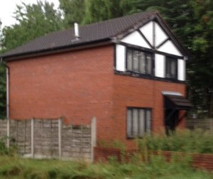
This house has just about the tackiest facade I have seen in a long time.
I don’t have a problem with people spending a bit of money on the front of the house. . . but this house breaks two of my rules for good design:
- Think about looking at the house from the side rather than just from the front. If you have a clear view of the side it needs a transition, or in this case a continuation of the white render along the side of the house.
- Make sure that the ends of the facade are well detailed. This looks so obviously ‘Stuck On’, but if it had been set between two projecting walls it would look much better.
For more thoughts see this link: What’s the Side View?